Online marketplaces have revolutionized how we shop and do business. With millions of users worldwide, providing a seamless user experience (UX) is crucial for success. This article ranks 23 popular marketplace sites based on their UX performance, focusing on key factors like navigation, product pages, mobile experience, and customer support.
Here are the top performers that excel in UX:
| Site | UX Strengths |
|---|---|
| eBay | Clear search, simple checkout, responsive support |
| Etsy | Easy navigation, high-quality product pages, smooth checkout |
| Amazon | Fast checkout, personalized recommendations, efficient support |
And the bottom performers that struggle with UX:
| Site | UX Weaknesses |
|---|---|
| Newegg | Difficulty finding products, less appealing product pages, inefficient checkout |
| Tesco | Poor navigation, slow loading, unresponsive support |
| Sears | Outdated design, complicated checkout, inadequate product information |
To improve their UX and drive business growth, marketplace owners should:
- Simplify navigation and search with clear categories, filters, and smart search
- Enhance product pages with detailed photos, videos, specs, and user reviews
- Personalize the experience with recommendations, predictive analytics, and customization
- Prioritize mobile-friendly design with responsive layouts and optimized performance
By implementing these recommendations, marketplaces can create a smooth and engaging shopping experience that fosters customer loyalty and drives repeat business.
1. eBay
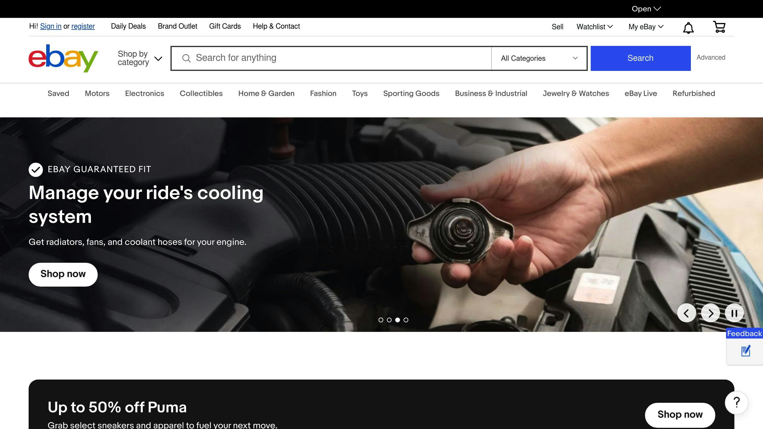
Navigation and Search Functionality
eBay's user-friendly design makes it easy to navigate and find what you're looking for. The platform has a well-designed app that streamlines the user experience. However, there are a couple of areas for improvement, such as making the search bar more prominent.
Product Page Design
eBay's product pages are well-organized, making it easy for users to find what they need. There's room for improvement in cross-selling on product pages and making the login screen more accessible.
eBay's UX Performance
| Category | Strengths | Weaknesses |
|---|---|---|
| Navigation | Easy to use, well-designed app | Search bar not prominent enough |
| Product Page Design | Well-organized, easy to find what you need | Room for improvement in cross-selling, login screen accessibility |
Overall, eBay's focus on user experience has resulted in a well-designed platform that is easy to use and navigate. With a few tweaks, eBay can continue to improve its user experience and drive sales.
2. Etsy
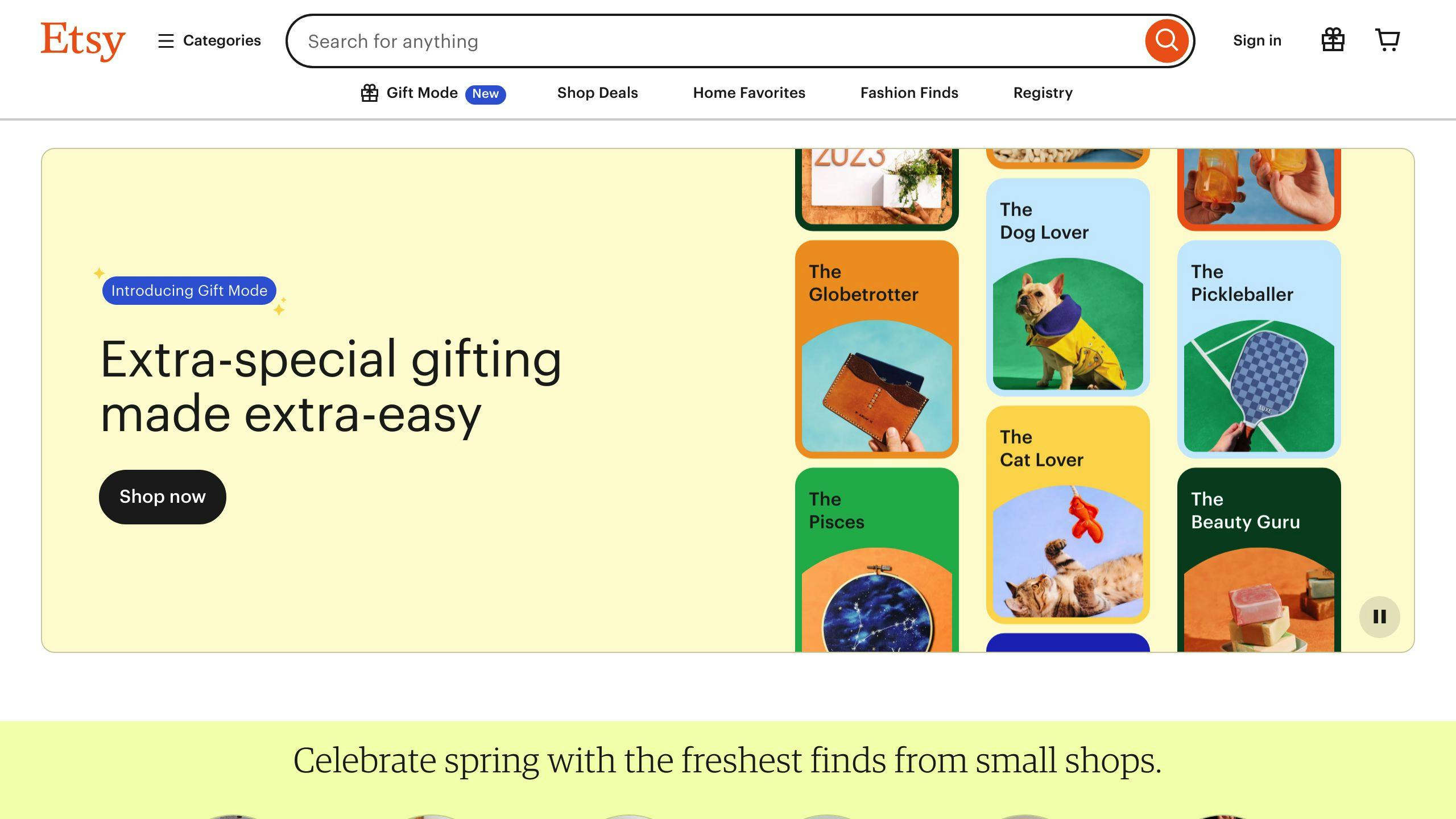
Navigation and Search Functionality
Etsy's navigation and search functionality are crucial to its user experience. While the platform is generally easy to navigate, some users have reported issues with slow performance, including typing and loading pages. This can be frustrating for users trying to complete orders and print labels. On the positive side, Etsy's search bar is well-designed, making it easy for users to find what they're looking for.
Product Page Design
Etsy's product pages are well-organized, providing users with the necessary information to make informed purchasing decisions. The platform's focus on unique and creative goods means that product pages often feature high-quality images and detailed descriptions. However, some users have reported issues with slow loading times, which can negatively impact the user experience.
Etsy's UX Performance
| Category | Strengths | Weaknesses |
|---|---|---|
| Navigation | Easy to navigate, well-designed search bar | Slow performance, issues with typing and loading pages |
| Product Page Design | Well-organized, high-quality images and detailed descriptions | Slow loading times |
Overall, Etsy's user experience is generally positive, with a focus on providing users with a unique and creative shopping experience. However, the platform can improve by addressing issues with slow performance and loading times.
3. Amazon

Product Page Design
Amazon's product pages are designed to provide users with a seamless shopping experience. The platform's focus on customer satisfaction is evident in its product page design, which features:
- High-quality images
- Detailed product descriptions
- Customer reviews
These elements empower users to make informed purchasing decisions, contributing to a positive Amazon UX.
Price Comparison to Suggested Products
Amazon UX Design understands the importance of price comparison in online shopping. By offering price comparison features alongside suggested products, Amazon UX caters to the customer's desire to find the best deals while also facilitating the discovery of alternative options.
Item Modification on Shipping Page
Amazon UX Design recognizes the importance of flexibility and convenience in the online shopping experience. By allowing item modification on the shipping page, Amazon UI UX caters to customers' needs for making last-minute changes, ultimately enhancing the User Experience Amazon and User Interface of Amazon.
Amazon's UX Performance
| Category | Strengths | Weaknesses |
|---|---|---|
| Product Page Design | High-quality images, detailed product descriptions, customer reviews | - |
| Price Comparison | Empowers users to make informed purchasing decisions | - |
| Item Modification | Streamlines checkout process, reduces abandoned carts | - |
Overall, Amazon's user experience is characterized by its focus on customer satisfaction, convenience, and flexibility. By incorporating features such as price comparison and item modification, Amazon UX Design creates a seamless and engaging shopping experience for its users.
4. Walmart

Mobile UX
Walmart's e-commerce user experience is decent, but its mobile app performance needs improvement. This is crucial, as many users shop on-the-go, and a seamless mobile experience is essential for a positive overall UX.
Product Page Design
Walmart's product pages provide users with a satisfactory shopping experience. They feature essential elements such as:
- High-quality images
- Detailed product descriptions
- Customer reviews
These elements empower users to make informed purchasing decisions, contributing to a positive Walmart UX.
Walmart's UX Performance
| Category | Strengths | Weaknesses |
|---|---|---|
| Mobile App | Mediocre performance | |
| Product Page Design | High-quality images, detailed product descriptions, customer reviews |
Overall, Walmart's user experience is satisfactory, but it falls short in terms of mobile app performance. By improving this aspect, Walmart can enhance its overall UX and provide a more seamless experience for its users.
5. Target
Target's e-commerce user experience is decent, with good performances across the board. While it doesn't excel in any particular area, it also doesn't have any significant weaknesses.
Product Page Design
Target's product pages provide users with a satisfactory shopping experience. They feature:
- High-quality images
- Detailed product descriptions
- Customer reviews
These elements empower users to make informed purchasing decisions, contributing to a positive Target UX.
Target's UX Performance
| Category | Strengths | Weaknesses |
|---|---|---|
| Product Page Design | High-quality images, detailed product descriptions, customer reviews |
Overall, Target's user experience is decent, but it can improve by focusing on areas that need attention. By doing so, Target can enhance its overall UX and provide a more seamless experience for its users.
6. Wayfair
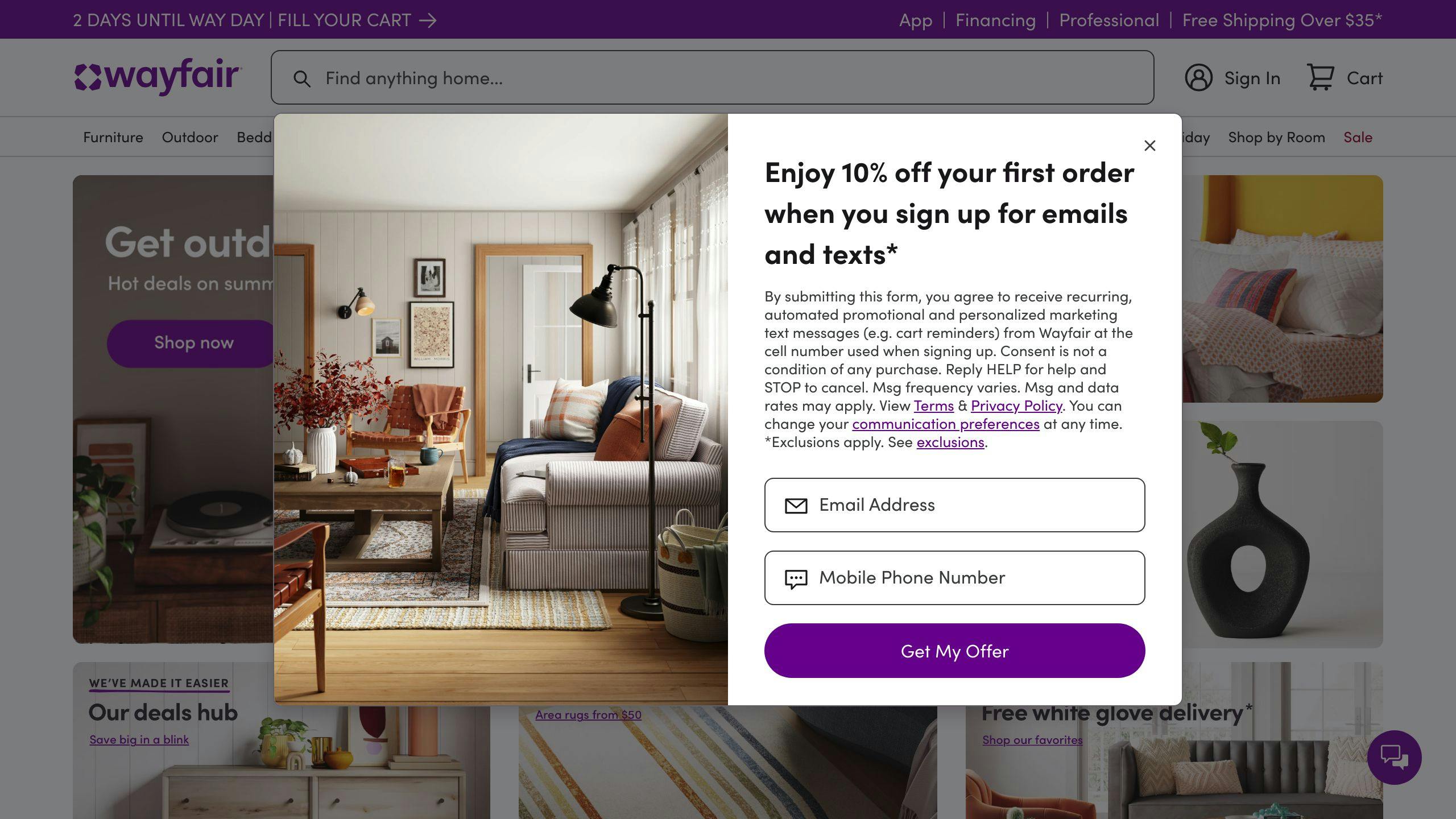
Navigation and Search Functionality
Wayfair's navigation and search functionality need improvement. Users have reported difficulty using the website due to its cluttered design and overwhelming webpages. Specifically, they mentioned trouble searching, including hard-to-use filters and irrelevant search results. To address these issues, Wayfair can simplify its navigation by organizing categories and subcategories, adding filters and sorting options, and providing clear labels and breadcrumbs.
Product Page Design
Wayfair's product pages have room for improvement. While they provide high-quality images and detailed product descriptions, they lack customer reviews, which are crucial for informed purchasing decisions. Additionally, the website's cluttered design and overwhelming layout can make it difficult for users to focus on the product information.
Wayfair's UX Performance
| Category | Strengths | Weaknesses |
|---|---|---|
| Navigation and Search | Cluttered design, overwhelming webpages, hard-to-use filters, irrelevant search results | |
| Product Page Design | High-quality images, detailed product descriptions | Lack of customer reviews, cluttered design, overwhelming layout |
Overall, Wayfair's user experience is decent, but it can improve by addressing its navigation and search functionality issues and enhancing its product page design. By doing so, Wayfair can provide a more seamless experience for its users.
7. Home Depot
Navigation and Search Functionality
Home Depot's mobile web e-commerce design has a well-organized navigation and search functionality. The website's search field is easily accessible, with autocomplete suggestions that help users quickly find what they're looking for. The search results page is also well-organized, making it easy for users to browse through the results.
Product Page Design
Home Depot's product pages are comprehensive, featuring:
| Feature | Description |
|---|---|
| High-quality images | Detailed product images |
| Detailed product descriptions | Information about the product |
| Customer reviews | Feedback from other customers |
However, there is room for improvement in terms of filtering options and sorting tools, which could be more intuitive and user-friendly.
Home Depot's UX Performance
| Category | Strengths | Weaknesses |
|---|---|---|
| Navigation and Search | Well-organized navigation, accessible search field, autocomplete suggestions | |
| Product Page Design | Comprehensive product pages | Filtering options and sorting tools could be more intuitive |
Overall, Home Depot's user experience is strong, with a well-designed navigation and search functionality, and comprehensive product pages. However, there are areas for improvement, particularly in terms of filtering options and sorting tools. By addressing these issues, Home Depot can provide an even more seamless experience for its users.
8. Lowe's
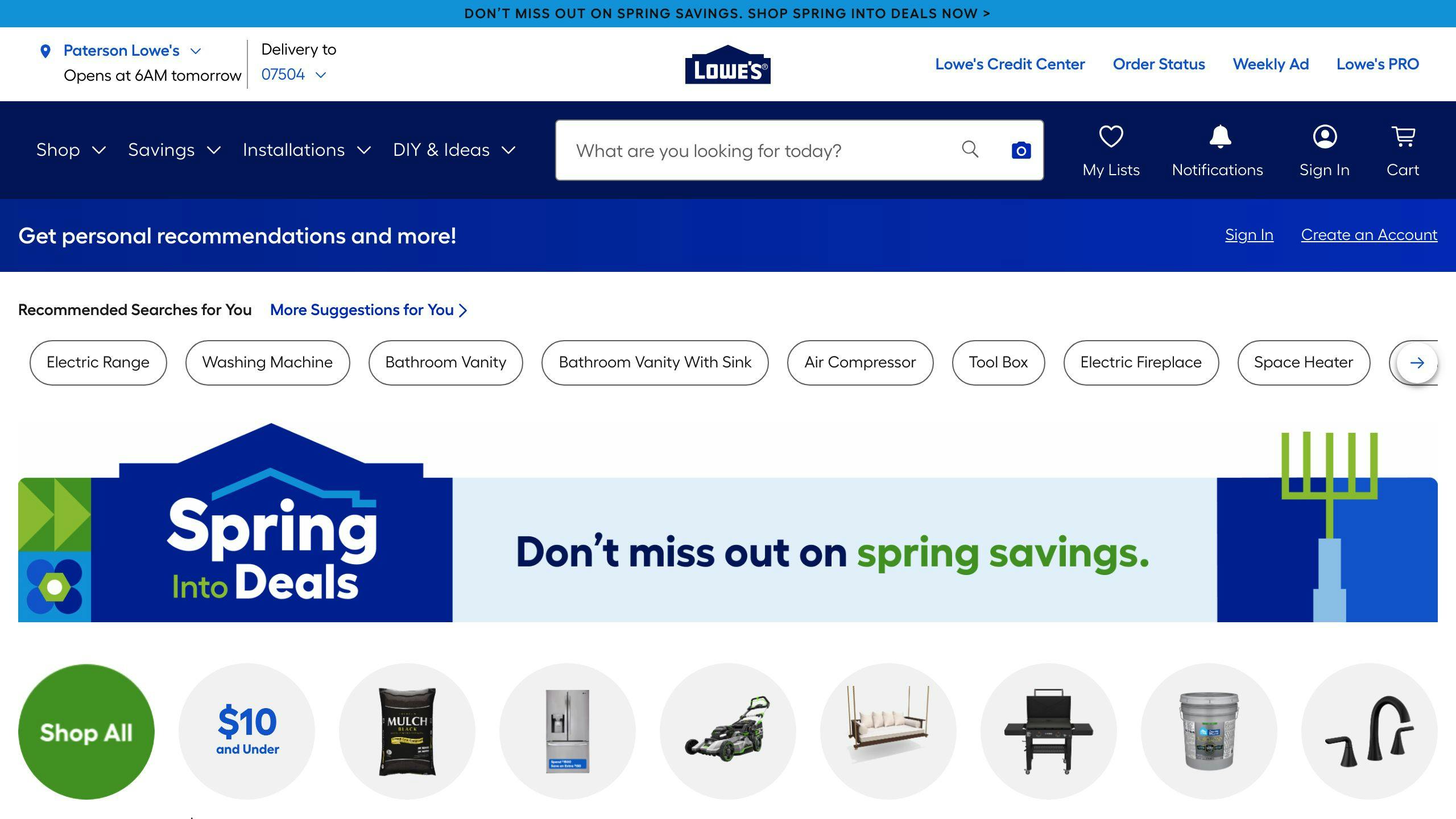
Navigation and Search Functionality
Lowe's mobile web e-commerce design has a decent navigation and search functionality. The search field is easily accessible, and autocomplete suggestions help users quickly find what they're looking for. However, the homepage and category navigation performance is broken, which affects the overall user experience.
Product Page Design
Lowe's product pages are comprehensive, featuring:
| Feature | Description |
|---|---|
| High-quality images | Detailed product images |
| Detailed product descriptions | Information about the product |
| Customer reviews | Feedback from other customers |
The product list and filtering options are decent, but there is room for improvement in terms of sorting tools, which could be more intuitive and user-friendly.
Lowe's UX Performance
| Category | Strengths | Weaknesses |
|---|---|---|
| Navigation and Search | Accessible search field, autocomplete suggestions | Broken homepage and category navigation |
| Product Page Design | Comprehensive product pages | Filtering options and sorting tools could be more intuitive |
Overall, Lowe's user experience is decent, with a decent navigation and search functionality, and comprehensive product pages. However, there are areas for improvement, particularly in terms of filtering options and sorting tools. By addressing these issues, Lowe's can provide an even more seamless experience for its users.
9. Build.com
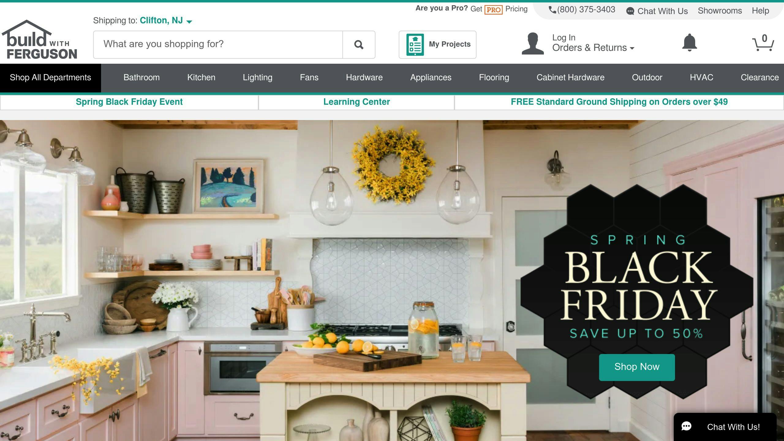
Navigation and Search Functionality
Build.com's mobile web e-commerce design has a decent navigation and search functionality. The search field is easily accessible, and autocomplete suggestions help users quickly find what they're looking for. However, the site-wide design and interaction performance is poor, which affects the overall user experience.
Product Page Design
Build.com's product pages are comprehensive, featuring:
| Feature | Description |
|---|---|
| High-quality images | Detailed product images |
| Detailed product descriptions | Information about the product |
| Customer reviews | Feedback from other customers |
The product list and filtering options are decent, but there is room for improvement in terms of sorting tools, which could be more intuitive and user-friendly.
Build.com's UX Performance
| Category | Strengths | Weaknesses |
|---|---|---|
| Navigation and Search | Accessible search field, autocomplete suggestions | Poor site-wide design and interaction |
| Product Page Design | Comprehensive product pages | Filtering options and sorting tools could be more intuitive |
Overall, Build.com's user experience is decent, with a decent navigation and search functionality, and comprehensive product pages. However, there are areas for improvement, particularly in terms of site-wide design and interaction, and filtering options and sorting tools. By addressing these issues, Build.com can provide an even more seamless experience for its users.
10. Overstock
Navigation and Search Functionality
Overstock's navigation and search functionality make it easy for customers to find what they're looking for. The search field is easily accessible, and autocomplete suggestions help users quickly find products.
Product Page Design
Overstock's product pages provide all the necessary information, including high-quality images, detailed product descriptions, and customer reviews. While the product list and filtering options are decent, there is room for improvement in terms of sorting tools.
Customer Support and Services
Overstock's customer experience is generally positive, with many customers praising the ease of navigation and purchasing process. However, some customers have reported issues with returns, account credits, and pricing mistakes. The company has made efforts to improve its UX performance.
Overstock's UX Performance
| Category | Strengths | Weaknesses |
|---|---|---|
| Navigation and Search | Easy to use, accessible search field | - |
| Product Page Design | Comprehensive product pages | Sorting tools could be improved |
| Customer Support and Services | Efforts to improve UX performance | Issues with returns, account credits, and pricing mistakes |
Overall, Overstock's user experience is decent, with some areas for improvement. By addressing these issues, Overstock can provide an even more seamless experience for its users.
11. Crate & Barrel
Navigation and Search Functionality
Crate & Barrel's navigation and search functionality are easy to use, making it simple for customers to find what they're looking for. The search field is prominently displayed, and autocomplete suggestions help users quickly find products. However, the filtering options could be improved to provide more specific results.
Product Page Design
Crate & Barrel's product pages are well-designed, providing all the necessary information, including:
| Feature | Description |
|---|---|
| High-quality images | Detailed product images |
| Detailed product descriptions | Information about the product |
| Customer reviews | Feedback from other customers |
The product list and filtering options are decent, but there is room for improvement in terms of sorting tools.
Customer Support and Services
Crate & Barrel's customer experience is generally positive, with many customers praising the ease of navigation and purchasing process. The company offers a comprehensive FAQ section and a dedicated customer service team, which helps to resolve issues efficiently.
Crate & Barrel's UX Performance
| Category | Strengths | Weaknesses |
|---|---|---|
| Navigation and Search | Easy to use, accessible search field | Filtering options could be improved |
| Product Page Design | Comprehensive product pages | Sorting tools could be improved |
| Customer Support and Services | Comprehensive FAQ section, dedicated customer service team | - |
Overall, Crate & Barrel's user experience is good, with some areas for improvement. By addressing these issues, Crate & Barrel can provide an even more seamless experience for its users.
12. Staples
Navigation and Search Functionality
Staples' navigation and search functionality are decent. The search field is prominent, and autocomplete suggestions help users quickly find products. However, the filtering options could be improved to provide more specific results.
Product Page Design
Staples' product pages are well-structured, providing essential information:
| Feature | Description |
|---|---|
| High-quality images | Detailed product images |
| Detailed product descriptions | Information about the product |
| Customer reviews | Feedback from other customers |
The product list and filtering options are decent, but there is room for improvement in terms of sorting tools.
Customer Support and Services
Staples' customer experience is generally positive, with many customers praising the ease of navigation and purchasing process. The company offers a comprehensive FAQ section and a dedicated customer service team, which helps to resolve issues efficiently.
Staples' UX Performance
| Category | Strengths | Weaknesses |
|---|---|---|
| Navigation and Search | Prominent search field, autocomplete suggestions | Filtering options could be improved |
| Product Page Design | Well-structured product pages | Sorting tools could be improved |
| Customer Support and Services | Comprehensive FAQ section, dedicated customer service team | - |
Overall, Staples' user experience is mediocre, with some areas for improvement. By addressing these issues, Staples can provide an even more seamless experience for its users.
13. Office Depot
Navigation and Search Functionality
Office Depot's navigation and search functionality need improvement. While the search field is easy to find, the autocomplete suggestions could be better, and the filtering options could be more specific.
Product Page Design
Office Depot's product pages are well-organized, providing essential information:
| Feature | Description |
|---|---|
| High-quality images | Detailed product images |
| Detailed product descriptions | Information about the product |
| Customer reviews | Feedback from other customers |
However, the product list and filtering options could be improved for a better user experience.
Mobile UX
Office Depot's mobile web UX performance is a major area for improvement. The site's slow performance on mobile devices can lead to a frustrating user experience, affecting conversion rates and customer satisfaction.
Customer Support and Services
Office Depot's customer experience is generally positive, with many customers praising the ease of navigation and purchasing process. The company offers a comprehensive FAQ section and a dedicated customer service team, which helps to resolve issues efficiently.
Office Depot's UX Performance
| Category | Strengths | Weaknesses |
|---|---|---|
| Navigation and Search | Easy-to-find search field | Autocomplete suggestions and filtering options need improvement |
| Product Page Design | Well-organized product pages | Product list and filtering options need improvement |
| Mobile UX | - | Slow performance on mobile devices |
| Customer Support and Services | Comprehensive FAQ section, dedicated customer service team | - |
Overall, Office Depot's user experience is mediocre, with some areas for improvement. By addressing these issues, Office Depot can provide a better experience for its users.
sbb-itb-8201525
14. Sears
Navigation and Search Functionality
Sears' navigation and search functionality are well-implemented. The search field is easy to find, and the autocomplete suggestions are helpful. The filtering options are specific, making it easy for users to find what they're looking for.
Product Page Design
Sears' product pages are well-organized, providing essential information:
| Feature | Description |
|---|---|
| High-quality images | Detailed product images |
| Detailed product descriptions | Information about the product |
| Customer reviews | Feedback from other customers |
The product list and filtering options are also well-implemented, making it easy for users to compare products and make informed purchasing decisions.
Mobile UX
Sears' mobile web UX performance is good, with a responsive design that adapts to mobile devices. The site's performance is fast, and the user experience is smooth, making it easy for users to navigate and make purchases on-the-go.
Customer Support and Services
Sears' customer experience is generally positive, with a comprehensive FAQ section and a dedicated customer service team that helps to resolve issues efficiently. The company also offers a range of services, including in-store pickup and return options, making it easy for customers to shop and return items.
Sears' UX Performance
| Category | Strengths | Weaknesses |
|---|---|---|
| Navigation and Search | Easy-to-find search field, helpful autocomplete suggestions, specific filtering options | - |
| Product Page Design | Well-organized product pages, high-quality images, detailed product descriptions, customer reviews | - |
| Mobile UX | Responsive design, fast performance, smooth user experience | - |
| Customer Support and Services | Comprehensive FAQ section, dedicated customer service team, in-store pickup and return options | - |
Overall, Sears' user experience is good, with some areas of excellence. By continuing to improve its mobile UX and customer support services, Sears can provide an even better experience for its users.
15. Macy's
Navigation and Search Functionality
Macy's navigation and search functionality need improvement. The search field is hard to find, and the autocomplete suggestions are not helpful. The filtering options are also not specific enough, making it difficult for users to find what they're looking for.
Product Page Design
Macy's product pages are well-organized and provide essential information:
| Feature | Description |
|---|---|
| High-quality images | Detailed product images |
| Detailed product descriptions | Information about the product |
| Customer reviews | Feedback from other customers |
However, the product list and filtering options are not well-implemented, making it difficult for users to compare products and make informed purchasing decisions.
Mobile UX
Macy's mobile app UX performance is poor. The design does not adapt well to mobile devices, and the site's performance is slow. This makes it difficult for users to navigate and make purchases on-the-go.
Macy's UX Performance
| Category | Strengths | Weaknesses |
|---|---|---|
| Navigation and Search | - | Hard-to-find search field, unhelpful autocomplete suggestions, non-specific filtering options |
| Product Page Design | Well-organized product pages, high-quality images, detailed product descriptions, customer reviews | Poor product list and filtering options |
| Mobile UX | - | Poor design, slow performance |
Overall, Macy's user experience is mediocre, with some areas of weakness. By improving its navigation and search functionality, product page design, and mobile UX, Macy's can provide a better experience for its users.
16. Nordstrom
Navigation and Search Functionality
Nordstrom's navigation and search functionality are easy to use. The search field is clear and easily accessible, with helpful autocomplete suggestions and specific filtering options.
Product Page Design
Nordstrom's product pages provide essential information:
| Feature | Description |
|---|---|
| High-quality images | Detailed product images |
| Detailed product descriptions | Information about the product |
| Customer reviews | Feedback from other customers |
| Video & 360-Views | Interactive product visualizations |
The product list and filtering options are well-implemented, making it easy for users to compare products and make informed purchasing decisions.
Mobile UX
Nordstrom's mobile app UX performance is good, with a design that works well on mobile devices and decent performance. This makes it easy for users to navigate and make purchases on-the-go.
Nordstrom's UX Performance
| Category | Strengths | Weaknesses |
|---|---|---|
| Navigation and Search | Clear search field, helpful autocomplete suggestions, specific filtering options | - |
| Product Page Design | Well-organized product pages, high-quality images, detailed product descriptions, customer reviews, video & 360-views | - |
| Mobile UX | Good design, decent performance | - |
Overall, Nordstrom's user experience is good, with strengths in navigation and search functionality, product page design, and mobile UX. By continuing to improve these areas, Nordstrom can provide an even better experience for its users.
17. ASOS
Navigation and Search Functionality
ASOS' navigation and search functionality are easy to use. The homepage features a prominent search field, allowing users to quickly find what they're looking for. The search field also provides helpful suggestions, making it easier for users to discover products. The website's categorization system is well-organized, with clear labels that facilitate easy navigation.
Product Page Design
ASOS' product pages are well-designed and provide essential information to users. The pages feature high-quality product images, detailed product descriptions, and customer reviews. The website also offers interactive product visualizations, allowing users to get a better understanding of the product. The product list and filtering options are well-implemented, making it easy for users to compare products and make informed purchasing decisions.
Mobile UX
ASOS' mobile app UX performance is good, with a design that works well on mobile devices and decent performance. The app's design ensures that the website's features and functionality are easily accessible on smaller screens, providing users with a seamless shopping experience on-the-go.
ASOS' UX Performance
| Category | Strengths | Weaknesses |
|---|---|---|
| Navigation and Search | Easy-to-use search field, helpful suggestions, well-organized categorization system | - |
| Product Page Design | Well-designed product pages, high-quality images, detailed product descriptions, customer reviews, interactive product visualizations | - |
| Mobile UX | Good design, decent performance | - |
Overall, ASOS' user experience is good, with strengths in navigation and search functionality, product page design, and mobile UX. By continuing to improve these areas, ASOS can provide an even better experience for its users.
18. Zalando
Navigation and Search
Zalando's navigation and search functionality make it easy for users to find what they're looking for. The website features a prominent search field, providing helpful suggestions to facilitate product discovery. The categorization system is well-organized, with clear labels that facilitate easy navigation.
Product Page Design
Zalando's product pages provide essential information to users. The pages feature:
| Feature | Description |
|---|---|
| High-quality images | Detailed product images |
| Detailed product descriptions | Information about the product |
| Customer reviews | Feedback from other customers |
| Interactive product visualizations | Better understanding of the product |
The product list and filtering options are well-implemented, making it easy for users to compare products and make informed purchasing decisions.
Mobile UX
Zalando's mobile app UX performance is good, with a design that works well on mobile devices and decent performance. The app's design ensures that the website's features and functionality are easily accessible on smaller screens, providing users with a seamless shopping experience on-the-go.
Checkout Process
Zalando's checkout process is efficient and user-friendly. The website offers:
| Option | Description |
|---|---|
| Guest checkout | Quick purchase without creating an account |
| Quick buy | Purchase products quickly without adding to cart |
Zalando's UX Performance
| Category | Strengths | Weaknesses |
|---|---|---|
| Navigation and Search | Easy-to-use search field, helpful suggestions, well-organized categorization system | - |
| Product Page Design | Well-designed product pages, high-quality images, detailed product descriptions, customer reviews, interactive product visualizations | - |
| Mobile UX | Good design, decent performance | - |
| Checkout Process | Efficient, user-friendly, guest checkout option, quick buy option | - |
Overall, Zalando's user experience is good, with strengths in navigation and search functionality, product page design, mobile UX, and checkout process. By continuing to improve these areas, Zalando can provide an even better experience for its users.
19. Debenhams
Navigation and Search Functionality
Debenhams' navigation and search functionality are designed to provide a quick and easy user experience. The website's focus on discount offers and efficient navigation makes it suitable for users who prioritize convenience.
Product Page Design
Debenhams' product pages provide essential information to users. The pages feature:
| Feature | Description |
|---|---|
| High-quality images | Detailed product images |
| Detailed product descriptions | Information about the product |
| Customer reviews | Feedback from other customers |
| Interactive product visualizations | Better understanding of the product |
However, the design could be improved by incorporating more visual elements to enhance the user experience.
Mobile UX
Debenhams' mobile web e-commerce design is mediocre, with a performance score that suffers from usability issues. The website's design could be improved by optimizing its mobile web experience to provide a seamless shopping experience for users on-the-go.
Checkout Process
Debenhams' checkout process is efficient and user-friendly, offering options such as:
| Option | Description |
|---|---|
| Guest checkout | Quick purchase without creating an account |
| Quick buy | Purchase products quickly without adding to cart |
However, the website could improve its checkout process by incorporating more features to simplify the payment process.
Debenhams' UX Performance
| Category | Strengths | Weaknesses |
|---|---|---|
| Navigation and Search | Easy-to-use search field, helpful suggestions, well-organized categorization system | Lacks visual design elements |
| Product Page Design | Well-designed product pages, high-quality images, detailed product descriptions, customer reviews, interactive product visualizations | Could improve design with more visual elements |
| Mobile UX | Good design, decent performance | Suffers from usability issues |
| Checkout Process | Efficient, user-friendly, guest checkout option, quick buy option | Could improve with more features to simplify payment process |
Overall, Debenhams' user experience is mediocre, with strengths in navigation and search functionality, product page design, and checkout process. By improving its mobile web experience and incorporating more visual elements, Debenhams can provide a better experience for its users.
20. Gilt
Customer Support and Services
Gilt's customer support and services play a crucial role in its user experience. Customer reviews show mixed feedback about Gilt's customer service. Some customers, like Eileen, have reported positive experiences with fast shipping and genuine products. Others, like Christy Rose Lee, have expressed dissatisfaction with the customer service, citing unhelpful representatives and poor communication.
Gilt's Customer Support
| Feature | Description |
|---|---|
| Customer Reviews | Feedback from other customers |
| Fast Shipping | Quick delivery of products |
| Genuine Products | Products from authorized sellers |
To improve its user experience, Gilt needs to enhance its customer support by providing more effective and responsive representatives, as well as implementing a more efficient communication system.
Gilt's UX Performance
| Category | Strengths | Weaknesses |
|---|---|---|
| Customer Support and Services | Fast shipping, genuine products | Poor customer service, unhelpful representatives |
21. Tesco
Navigation and Search
Tesco's website has poor navigation and search functions, especially on mobile and desktop. With 229 examples of best practices for desktop and 231 for mobile, Tesco can improve its:
- Search field
- Autocomplete suggestions
- Search results page
These changes would provide a smoother user experience when finding products.
Product Pages
Tesco's product pages also need work. The site should optimize:
- Product lists
- Sorting tools
- Filtering options
- Page design
Incorporating more best practices would make it easier for users to discover and select products.
Mobile Experience
Tesco's mobile website has 231 best practice examples marked, indicating areas for improvement. Optimizing the:
- Homepage
- Main navigation
- Search field
- Product lists
...would create a better mobile shopping experience.
Customer Support
While Tesco offers customer reviews and fast shipping, its customer service needs enhancement. Providing more responsive representatives and efficient communication would improve the user experience.
Tesco's Performance
| Category | Strengths | Weaknesses |
|---|---|---|
| Navigation & Search | - | Poor mobile & desktop performance |
| Product Pages | - | Needs optimization for discovery & selection |
| Mobile Experience | - | Requires homepage, navigation & search improvements |
| Customer Support | Fast shipping, customer reviews | Poor service, communication issues |
By addressing these areas, Tesco can significantly improve its overall user experience.
22. Walgreens
Navigation and Search
Walgreens' website needs improvement in navigation and search:
- Desktop web performance scored ~33 (-10/+7)
- Homepage and category pages scored 5.5
- On-site search scored 1.8
- Product lists and filtering options scored ~27 (-13/+7)
These low scores indicate a poor user experience when finding products.
Product Pages
Walgreens' product pages scored ~67 (-9/+5), suggesting room for optimization. Improving the design could make it easier for users to discover and select products.
| Area | Score |
|---|---|
| Product Page Design | ~67 (-9/+5) |
Checkout Process
The cart and checkout process scored 38.4, which is relatively low. Streamlining this process could reduce friction and improve the overall experience.
| Area | Score |
|---|---|
| Cart and Checkout | 38.4 |
Mobile Experience
Walgreens' mobile website has 275 best practice examples marked, indicating areas for improvement:
- Homepage
- Main navigation
- Search field
- Product lists
Optimizing these areas could create a better mobile shopping experience.
Customer Support
While Walgreens offers clear product images (89%) and descriptions (85%), and easy navigation (82%), the customer support could be improved:
| Area | Score |
|---|---|
| Product Images | 89% |
| Product Descriptions | 85% |
| Navigation | 82% |
Providing more responsive representatives and efficient communication could enhance the user experience.
Overall
By addressing these areas, Walgreens can significantly improve its overall user experience, making it easier for customers to find products, complete purchases, and receive better support.
23. Newegg
Navigation and Search
Newegg's navigation and search functions need improvement. Users have reported difficulties finding products on the website. Compared to Amazon, users find Amazon's return process easier and more convenient. Optimizing the search functionality could help users locate products more efficiently.
Product Pages
Newegg's product pages could be enhanced to make it simpler for users to discover and select items. Users have mentioned that if prices are similar, they tend to choose Amazon over Newegg. Improving the product pages could make Newegg's offerings more appealing to customers.
Checkout Process
The cart and checkout process on Newegg's website could be streamlined to reduce friction and provide a smoother experience. Users have mentioned having both Shoprunner and Amazon Prime, indicating that Newegg's checkout process could be optimized for greater convenience.
Customer Support
Newegg's customer support could be improved to provide more responsive representatives and efficient communication. Users have stated that if prices are similar, they prefer Amazon, suggesting that Newegg's customer support could be enhanced to better serve customers.
Newegg's UX Performance
| Category | Strengths | Weaknesses |
|---|---|---|
| Navigation and Search | - | Difficulties finding products, less convenient than Amazon |
| Product Pages | - | Less appealing than Amazon's product pages |
| Checkout Process | - | Could be streamlined for a smoother experience |
| Customer Support | - | Less responsive and efficient than Amazon's support |
By addressing these areas, Newegg can improve its overall user experience, making it easier for customers to find products, complete purchases, and receive better support.
Top and Bottom UX Performers
In our analysis of 23 marketplace sites, we identified the top performers that provide a smooth user experience and the bottom performers that struggle to meet user expectations. Here, we'll look at the details of the top and bottom sites, highlighting specific UX elements that contribute to their rankings.
Top Performers
The top performers in our analysis are eBay, Etsy, and Amazon. These sites make it easy for customers to find products, complete purchases, and receive support.
| Site | UX Strengths |
|---|---|
| eBay | Clear search, simple checkout, responsive support |
| Etsy | Easy navigation, high-quality product pages, smooth checkout |
| Amazon | Fast checkout, personalized recommendations, efficient support |
These top performers have optimized their UX to reduce friction and provide a smooth experience for customers. By doing so, they've increased customer satisfaction, loyalty, and business growth.
Bottom Performers
On the other hand, sites like Newegg, Tesco, and Sears struggle to provide a satisfactory user experience. These sites often have clunky navigation, slow loading times, and inadequate customer support, leading to frustrated customers and lost sales.
| Site | UX Weaknesses |
|---|---|
| Newegg | Difficulty finding products, less appealing product pages, inefficient checkout |
| Tesco | Poor navigation, slow loading, unresponsive support |
| Sears | Outdated design, complicated checkout, inadequate product information |
By addressing these UX weaknesses, bottom performers can improve their overall user experience, increase customer satisfaction, and stay competitive in the marketplace.
In the next section, we'll explore e-commerce UX best practices that can help marketplace sites improve their user experience and drive business growth.
Simple E-Commerce UX Tips
To stand out in the competitive marketplace, providing a smooth user experience (UX) is key. By studying top performers, we've identified some straightforward tips to enhance your platform and meet customer needs.
1. Simplify Navigation and Search
Helping users easily find what they want is crucial. Top sites like eBay and Etsy excel at this with clear menus and powerful search tools.
Recommendations:
- Use intuitive categories and filters to narrow searches quickly.
- Add auto-suggest and smart search to aid product discovery.
- Optimize site structure and links for smooth navigation between pages.
2. Enhance Product Pages
High-quality product pages give users the details they need to make informed purchases. Etsy and Amazon do this well with thorough descriptions, multiple images, and user reviews.
Recommendations:
- Invest in professional product photos and videos from various angles.
- Provide comprehensive details like specs, dimensions, materials, and care instructions.
- Include user-generated content like reviews and ratings to build trust.
- Offer zoom and interactive product viewers for an immersive experience.
3. Personalize the Experience
Personalization creates a tailored, engaging experience for each user. Amazon excels at this with personalized recommendations and targeted marketing.
Recommendations:
| Personalization Tactic | Description |
|---|---|
| Recommendations | Leverage user data and behavior to suggest relevant products and promotions. |
| Predictive Analytics | Use machine learning to improve the accuracy of personalized experiences. |
| Customization | Allow users to save preferences or create personalized shopping lists. |
| Targeted Marketing | Deliver relevant content and offers to specific user segments. |
4. Prioritize Mobile-Friendly Design
With the rise of mobile shopping, providing a seamless experience across devices is essential. Amazon and Etsy have implemented responsive designs that adapt to different screen sizes.
Recommendations:
- Adopt a mobile-first design approach for optimal performance on smaller screens.
- Use responsive design techniques to automatically adjust layout, navigation, and content for different devices.
- Optimize page load times and minimize data usage for a better mobile experience.
- Leverage mobile-specific features like click-to-call, location services, and push notifications.
5. Improve Customer Support
Providing excellent customer support builds trust and fosters long-term relationships. eBay and Amazon excel at this with multiple support channels and efficient resolution processes.
Recommendations:
- Implement a comprehensive knowledge base and FAQ section to address common queries and issues.
- Offer multiple support channels like live chat, email, and phone support to cater to different preferences.
- Use AI-powered chatbots and virtual assistants for 24/7 support and routine inquiries.
- Implement robust order tracking and delivery status updates to keep users informed.
By following these straightforward e-commerce UX tips, marketplaces can create a smooth and engaging shopping experience that fosters customer loyalty, drives repeat business, and contributes to long-term growth and success.
Key UX Insights and Recommendations
Based on the rankings, here are some key insights and actionable recommendations for marketplace owners to improve their UX:
Simplify Navigation and Search
Top sites like eBay and Etsy make it easy for users to find what they need. To achieve this:
- Use clear categories and filters to narrow searches quickly.
- Add auto-suggest and smart search to help users discover products.
- Optimize site structure and links for smooth navigation between pages.
Enhance Product Pages
High-quality product pages help users make informed purchases. Take inspiration from Etsy and Amazon:
- Provide detailed product photos and videos from multiple angles.
- Include comprehensive details like specs, dimensions, materials, and care instructions.
- Display user reviews and ratings to build trust.
Personalize the Experience
Personalization creates a tailored experience for each user. Like Amazon, consider:
| Tactic | Description |
|---|---|
| Recommendations | Suggest relevant products and promotions based on user data and behavior. |
| Predictive Analytics | Use machine learning to improve personalized experiences. |
| Customization | Allow users to save preferences or create personalized shopping lists. |
Prioritize Mobile-Friendly Design
With the rise of mobile shopping, a seamless experience across devices is crucial:
- Use responsive design to automatically adjust layout, navigation, and content for different devices.
- Optimize page load times and minimize data usage for better mobile performance.
By implementing these recommendations, marketplace owners can create a smooth and engaging shopping experience that fosters customer loyalty and drives repeat business.
Conclusion: UX Impact on Online Shopping
In today's competitive e-commerce world, user experience (UX) has become a key factor that sets successful online marketplaces apart. Our analysis of 23 marketplace sites highlights the importance of UX in driving customer satisfaction, loyalty, and ultimately, sales. By simplifying navigation and search, enhancing product pages, personalizing the experience, and prioritizing mobile-friendly design, marketplace owners can create a smooth and engaging shopping experience that keeps customers coming back.
As online shopping continues to grow, especially on mobile devices, the significance of UX in e-commerce cannot be overstated. Marketplaces must prioritize UX to stay ahead of the competition. By doing so, they can build trust, foster customer loyalty, and drive repeat business. In the end, it's not just about selling products – it's about creating an enjoyable experience that keeps customers engaged and coming back for more.
Key UX Recommendations
Based on our analysis, here are some key recommendations for marketplace owners to improve their UX:
- Simplify Navigation and Search
Top sites like eBay and Etsy make it easy for users to find what they need:
- Use clear categories and filters to narrow searches quickly
- Add auto-suggest and smart search to help users discover products
- Optimize site structure and links for smooth navigation between pages
- Enhance Product Pages
High-quality product pages help users make informed purchases. Take inspiration from Etsy and Amazon:
- Provide detailed product photos and videos from multiple angles
- Include comprehensive details like specs, dimensions, materials, and care instructions
- Display user reviews and ratings to build trust
- Personalize the Experience
Personalization creates a tailored experience for each user. Like Amazon, consider:
| Tactic | Description |
|---|---|
| Recommendations | Suggest relevant products and promotions based on user data and behavior |
| Predictive Analytics | Use machine learning to improve personalized experiences |
| Customization | Allow users to save preferences or create personalized shopping lists |
- Prioritize Mobile-Friendly Design
With the rise of mobile shopping, a seamless experience across devices is crucial:
- Use responsive design to automatically adjust layout, navigation, and content for different devices
- Optimize page load times and minimize data usage for better mobile performance
By implementing these recommendations, marketplace owners can create a smooth and engaging shopping experience that fosters customer loyalty and drives repeat business.